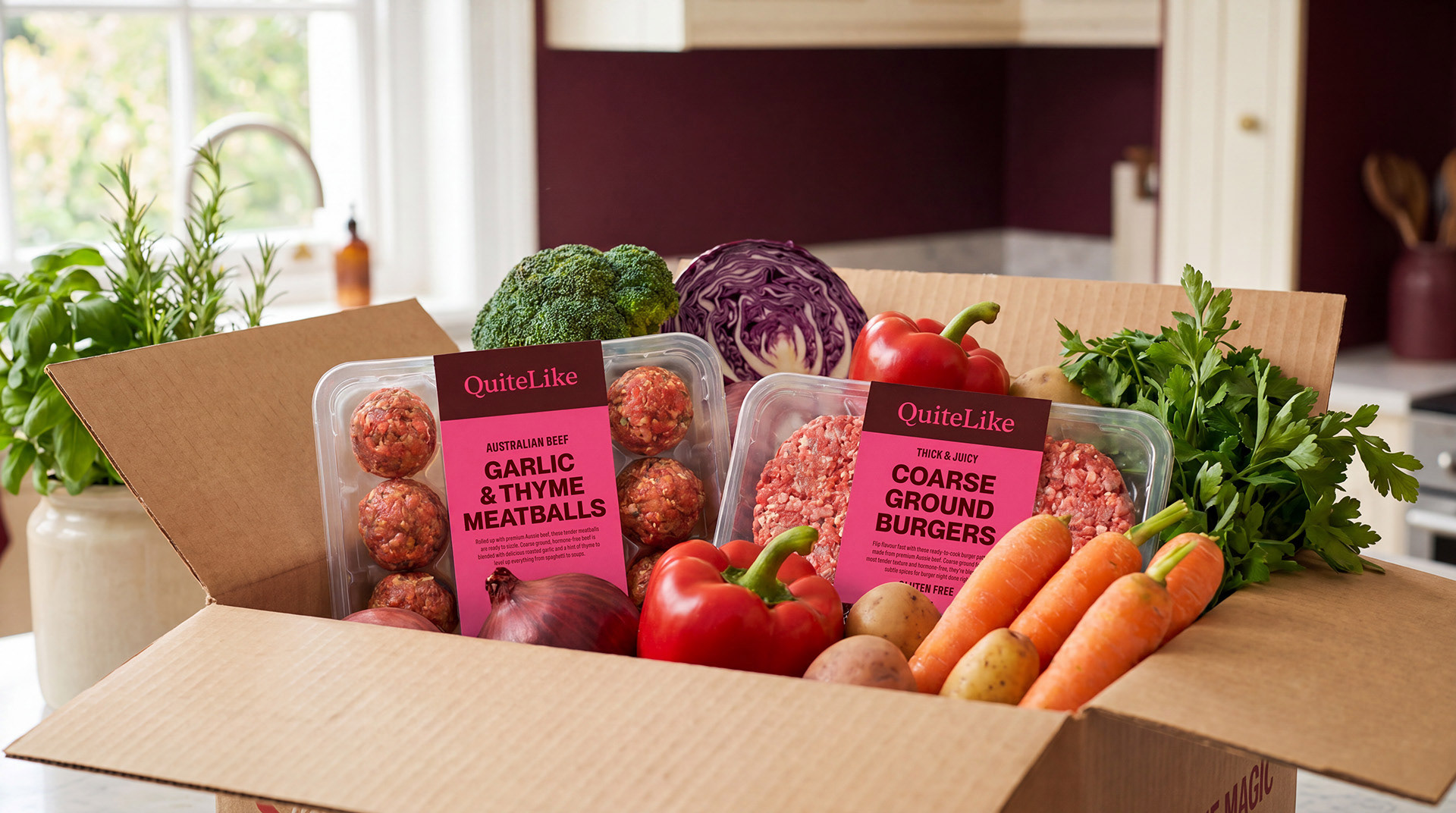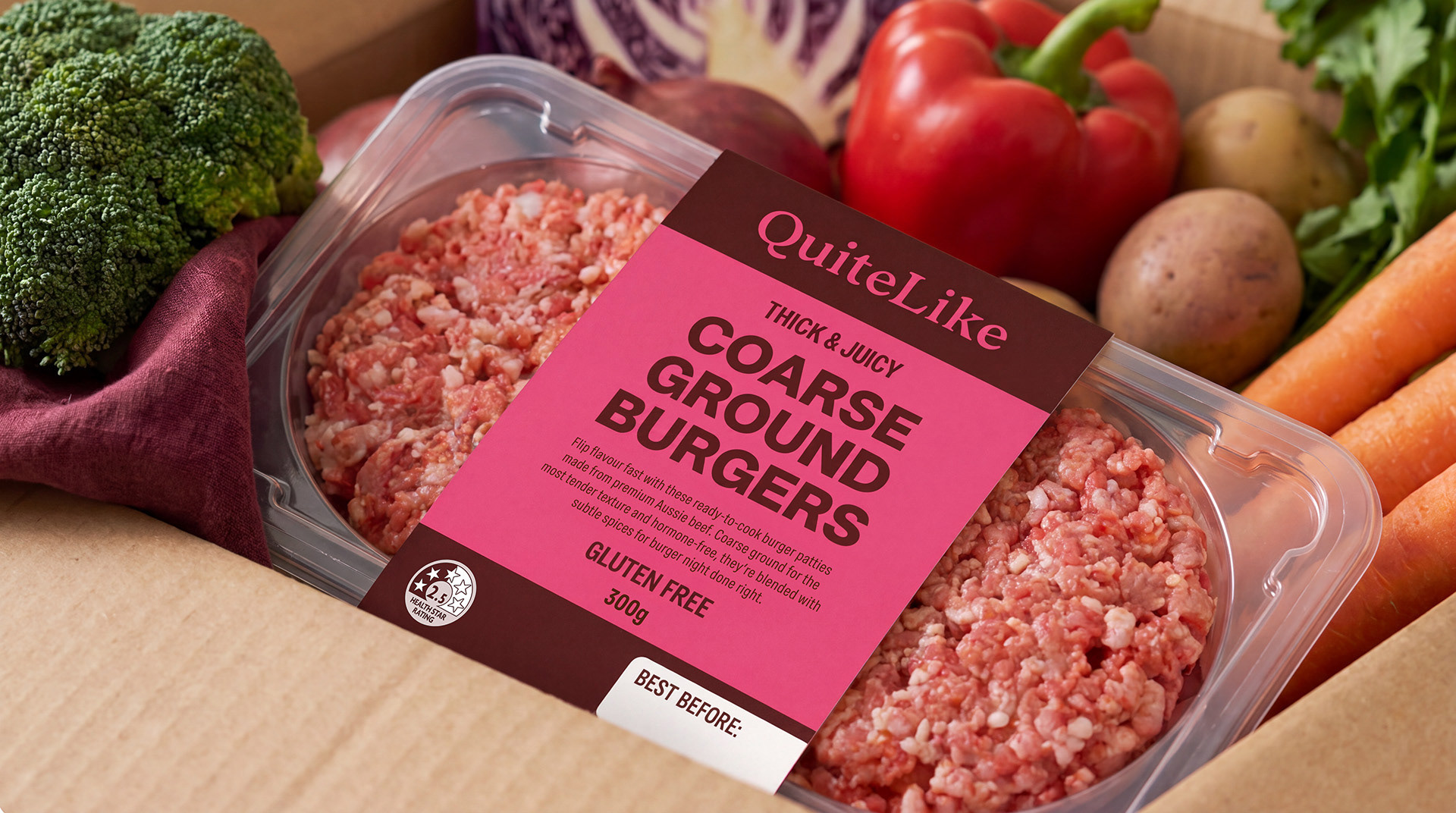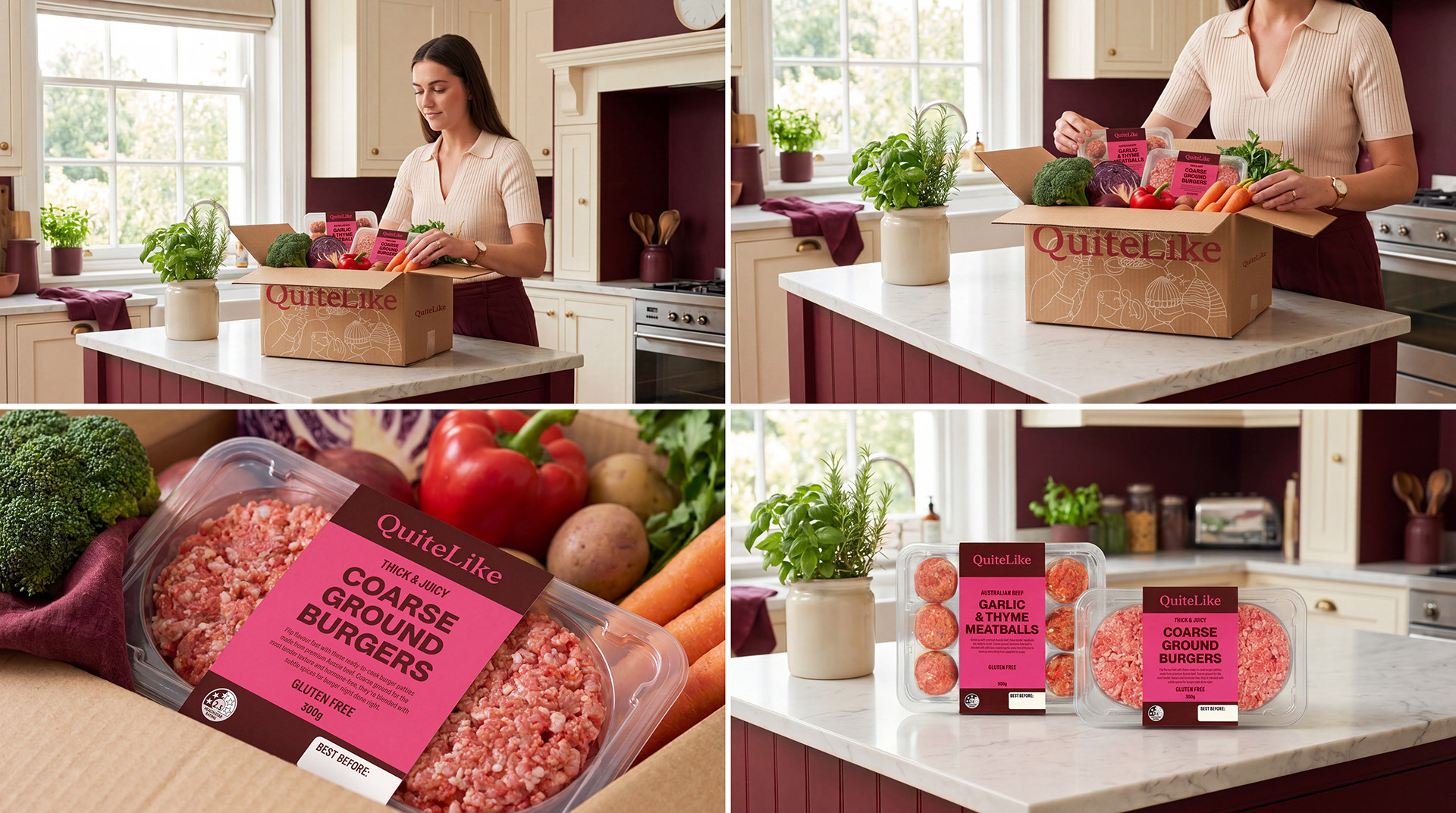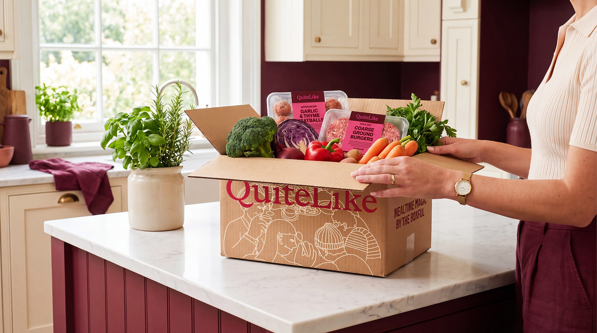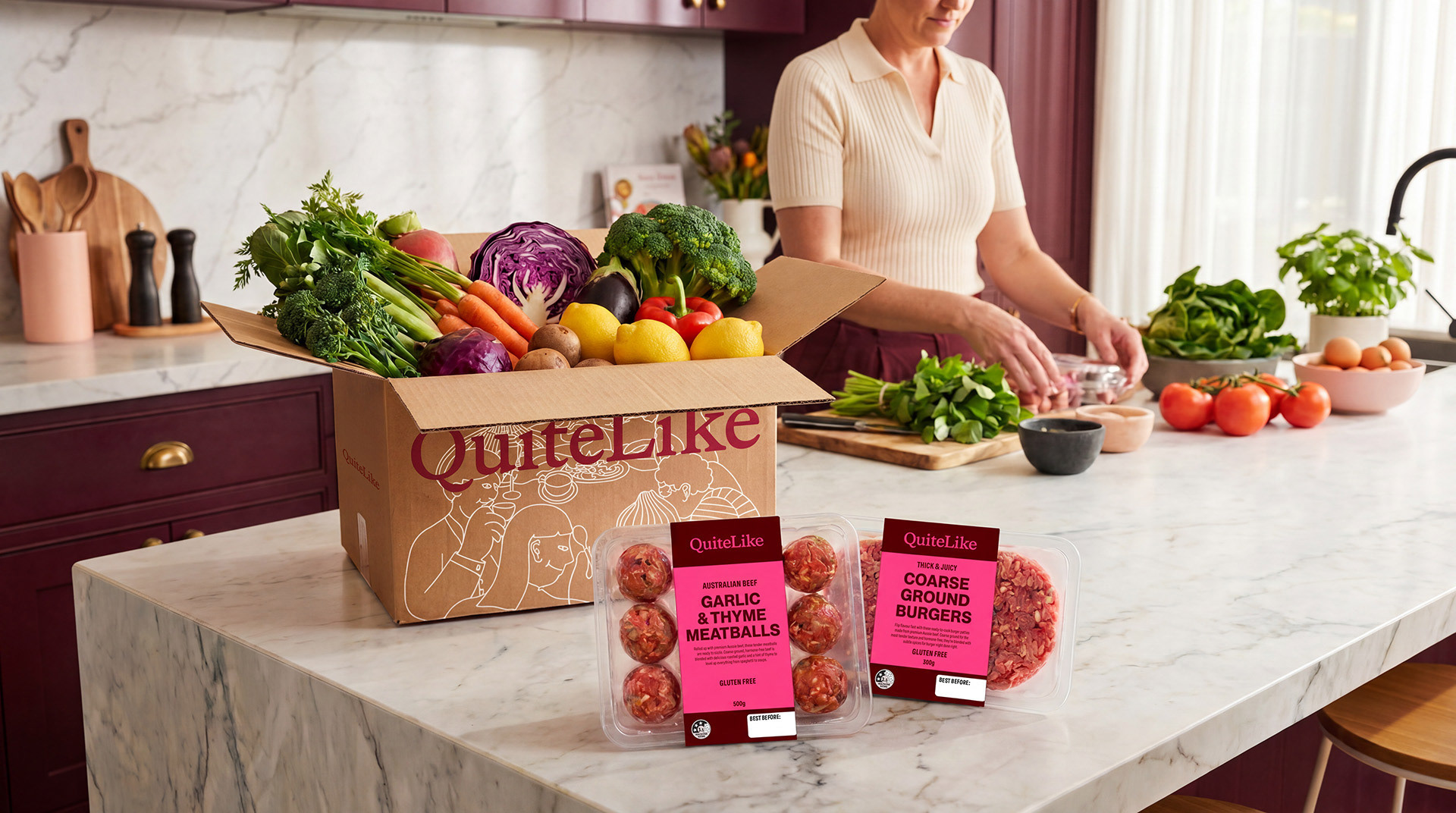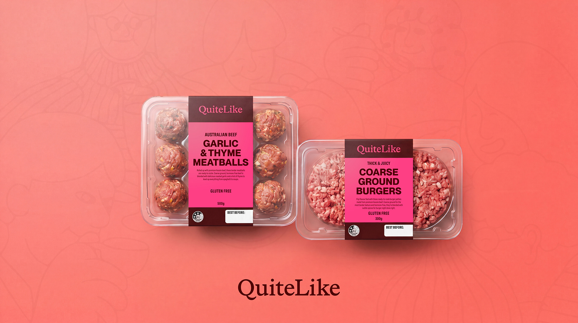
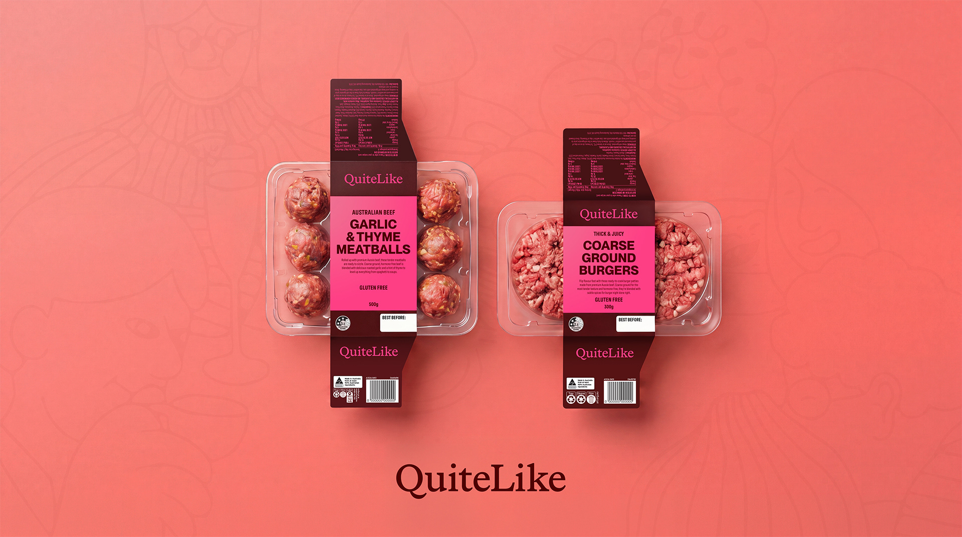
Created for QuiteLike, this packaging system uses bold typography, sharp colour contrast, and a clean, contemporary layout to strengthen the brand’s confident, modern tone. The design focuses on clarity and quick readability, establishing a cohesive visual language that elevates the meal‑kit experience and creates a strong, consistent presence across the range.